Monday, December 31, 2012

Five Easy to sew 1950's Prom and Party Dresses

how to sew 1950s prom dress or party dress or 1940s dress

Here's how to sew five classic prom or party dresses from the very early 1950's (and late 1940's).  By using one of the current sewing patterns here, these styles can be made for today's parties, weddings and proms.  I also included the cute swing coat jacket shown here as a party cover-up.

It's great how many magazine archives are now online.  The Australian Home Journal collection from the late 1940's through early 1950's has monthly fashion features such as the two pages shown here showing spring gowns that could be sewn by most women at home.  These are easy to sew styles that feature simple but effective details.

50s or 1940s prom and party gowns to sew

Illustration above, Spring 1951:
A-ballet length gown with bertha style collar, B-swing coat, 
C-gown with sweetheart neckline, D-Gown with long sleeves

50s or 40s dresses for prom party or wedding to sew

Illustration above, Spring 1949:
E-short sleeves with puffed trim, F-sweetheart neckline with lace trim
G-draped shelf bra bodice with short puffed sleeves

To create your own version of a late 1940's or early 1950's party dress or prom gown, I have found some current patterns that will help you to sew up a vintage party dress of your own.  Select the view above that you like, and you'll find the modern pattern to make it up listed below.

butterick 6022 vogue 8146 mccalls 7281 mccalls 7049 butterick5882

View A- Butterick 6022 has a similar bertha collar that can be sewn in contrast print or lace and made with or without sleeves.

View B- Vogue 8146 includes a short swing coat that could be worn with the collar turned up.

Views C and F- Curved sweetheart necklines are seen in both illustrations. A good pattern for the sweetheart necklines is McCall's 7281, which features a princess seamed bodice for a great fit.  McCalls 7049 has two sweetheart strapless bodices, one that is simple darts, the other with princess seamlines. To get the curved bodice line in B, add a fold of ribbon around the sweetheart neckline.  For F add ruffled lace edging and "pinch" a few gathers into center front bustline. 

View E- Butterick 6022 has a good bodice, low waist and short sleeves for this look.  Also, McCall's 7083 is a basic dress pattern with sleeves and princess seamed bodice that can be used.  If the neckline were lowered and a puffed edge of chiffon trim were added, this same look could be achieved.

View G-The last dress with draped neckline looks almost like a shelf bra and is similar to Butterick 5882, although this pattern does not have sleeves.

1950s or 60s prom or party dress how to sew

I had to include this cute tip for a little puffed sleeve to wear with a strapless bodice.  It's as simple as a tube of fabric with elastic at the top edge.  The dress is similar to View F above, and the illustration here shows how the front has a line of gathers up the center that emphasizes the sweetheart neckline shape.

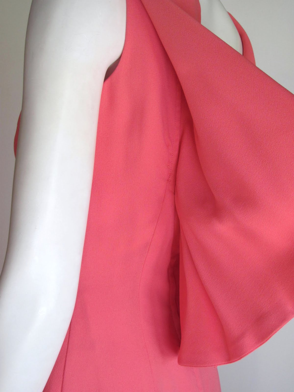
Fabric suggestions are for soft, not stiff, fabrics that have some weight like satin, taffeta, faille or crepe.  It should also be noted that bodices had few bones to support the styles.  These were often in the side seams only.  Zippers were popular in the left side seam, instead of the back seam.  This was to keep the back view pretty and smooth, without the look of a zipper showing down the back.


Fashion pages from Australian Home Journal, 1949 and 1951

Sunday, December 16, 2012

1948 Coat: Fashion Illustration by M. Bolegard


In the Post WWII years, 1940's coats became more feminine and fitted. This version from 1948 has a cape shoulder and embellishment that is probably braid or soutache trims. Made in the princess seamed silhouette, the coat has a fit and flare style that was so new in the late 1940's. The era that followed the war showed many looks that used a considerable amount of fabric, something that was impossible during the war. The romantic trend was also part of the Victorian revival where crinoline dresses became the norm.

We also can't help but notice the vivacious red accessories. This perky hat predicts the trends seen through the 1950's, with a bit of trim and veiling.

This is an advertisement for both the "Edelson" label and wool gabardine by Lorraine Fabrics of New York. Look for the textile label when you find a vintage coat. Sometimes that may help you determine the date.

The Fashion Illustration

This is illustration was signed by "M Bolegard". It is an ink wash with black brush lines. Great accents are seen in the red details.

India ink is a rich, heavy black ink that can be diluted with water to produce sheer gray washes. Using a heavy paper with some texture, a pencil sketch was made first, often using a live model. Next, the shading was added using light gray washes. When those dried, saturate black ink was brushed on to create the illustration.

The red elements would have been painted with guache or watercolor at the same time as the gray under wash. To get that very white glove, a 'mask' of rubber cement could have been brushed on the area before adding the washes. This mask would then be rubbed off after the wash had dried, revealing the original unpainted white paper. White also may have been painted in with guache. It would have covered any gray wash to create a 'pop' of white.

The name "Bolegard" as an illustrator appears to be often used without a first name. This artist worked for department stores such as Marshal Field & Company in Chicago as early as 1919, and was probably a resident of that city at that time.

Reference: Catalog of Commercial Art, Exhibition, 1920, but Society of Art Directors, Art Institute of Chicago

Sunday, December 9, 2012

Let's Talk About: Chanel Metiers d'Art, 2013 & Historical Inspiration


The Chanel Metiers d'Art for Fall 2013 has been buzzing big online this week. In part, it was the lush use of Scottish textiles and heather colors that caught the eye of everyone who has seen it. But another facet of this collection are the direct references to Elizabethan era fashion, men's apparel in particular. This slide shows both a runway look and men's doublets from the late 1500's that could have inspired it.


Lagerfeld has always shown an interest in using historical references to inspire his work, and this design from the early 1600's is a great example of how skillfully he can take a strong historical silhouette and create modern fashion that feels new and exciting.


The three slides shown include several runway ensembles along with original historical portraits. I hope they help to demonstrate how closely Lagerfeld used the late 1500's to mid-1600's as design inspiration. The women in black dresses with white lace accents from 1600's were obviously used to inspire this black dress on the runway. It also is easy to see where he worked with current trends for line, silhouette, color and texture to produce dramatic and new design ideas that are clearly derived from the past.

It is brilliant and creative collections like this one that drive fashion forward and give us something to talk about and try out for ourselves. Keep your eye on Fall 2013, we may see more of styles like these as other brands modify and copy Lagerfeld's lead.


This original article on fashion is part 9 of a series called "Let's Talk About:" that is posted only here at Pintucks. The contents of this article are the intellectual property of this blog. Please do not copy any content or images to another blog or digital media without contacting me first. I will ask that you link back to this article and give reference to this source within your feature. If you are using content or images for a research paper or project, please link back to this page in the traditional academic format, thank you!

Thursday, November 29, 2012

Made in Los Angeles: Branding Local Fashions


While the idea of promoting domestically produced apparel seems like a great idea, the reality of organizing, marketing and implementing any such program is much more involved and political that it seems on the surface.

We can all agree that we want to know more about where our apparel comes from. 'Country of Origin' tags inside our clothes help to list that for us, but hang tags can emphasize that even more. Over the past decade, Los Angeles has become a top of apparel design and manufacturing region. While labels here may produce their product locally, at this time there isn’t any local hang tag to note that for the shopper. Some brands do carry the “Made in California” logo, but the actual state region is not listed.

In an attempt to brand the city of Los Angeles as a fashion capitol for design through manufacturing, the mayor has released a new logo promoting L.A. fashion. Intended as a label or hang tag, it boasts “Designed & Made in Los Angeles”. Behind this label is a new program to promote Los Angeles’s apparel industry, create resource guides, and other means of support for local companies.

The “Made in California” program already exists, and for some companies that is a strong branding tool that some aren’t in a hurry to trade off for the new localized tag. Another concern is that manufacturing in the Los Angeles region spreads wider than the city boundaries. The new “Made in L.A.” logo must be supported by performing all design and manufacturing functions with-in the city limits.

Rozae Nichols, who designs and produces her high end fashions in the city and is a well known proponent of local design and manufacturing injected a note of reality to the proposal to comment that for her, to produce off shore isn't always bad for her business.

Trina Turk also commented that she is already using the "Made in California" logo. She also noted that her customer is more concerned about style and fit when making their purchase. Turk’s line has long been designed locally and a significant portion of the products are manufactured in the region. She went on to point out that because of labor costs, she can only produce her more simple garments in the city. Items requiring more labor are made off shore. This is essential for keeping her price points in line with the market.

There is a concern that this new program has the requirement for all design and production to be Los Angeles city based. This is where simple to manufacture T shirt and sport clothing manufacturers such as American Apparel can be successful, while garment designers whose product is more complex must still seek off shore production. This creates a ‘split’ manufacturing concept with both local and off-shore production.

Will brands with this method of manufacturing be able to carry the tag? Will various products by one label be tagged, while other items in the line are not? These and other questions remain to be answered.

Many local but California designed and produced brands will be ‘out’ in this game. By confining the hang tag to companies located only in Los Angeles many labels designed in the city but manufactured in the San Fernando valley (where many are located in what had been the center of the aerospace industry in the mid-century), and the vast areas of L.A. county’s industrial belt will be ‘out’. This could make selecting a contractor tricky at best for the L.A. based design house.

It is important to understand that many companies have design rooms located in the city core, but the manufacturing process might be located further away in other cities and unincorporated county sites that offer less expensive locations to rent and maintain.

Another concern is what the hang tag will mean as a brand. Los Angeles produces a wide and diverse selection of apparel. This range covers items that will be sold at low price points on up to nearly couture level garments. How will the localized branding cover this stretch in quality and price points?

It may be difficult to ‘sell’ the idea of a regional tag to the higher priced design companies, since cheaply produced apparel will be able to carry the same hang tag along with their higher priced labels. The city logo won’t be able to signify high quality or design superiority.

Perhaps the mayor’s announcement (timed with the Spring Fashion Week in L.A. in October) was premature. The obvious support such an initiative requires, such as a web-site and resource lists and more importantly a large team of labels and manufacturers on board for support are as yet unformed. With only 19 out of 10,000 companies supporting this logo, most are taking a ‘wait and see’ position on this new concept.


To read more:
Los Angeles hopes to make a fashion statement
October 21, 2012|By Adam Tschorn and Booth Moore | Los Angeles Times

A PDF file of this article can be found HERE:

Tuesday, November 27, 2012

The Delineator Magazine: July 1925, Flapper Fashions

Finding a magazine from the 1920's with fashions is always fun, and "The Delineator" from July, 1925 is a good one. Most of this issue has fully illustrated pages that are filled with fashions. Published by Butterick patterns, the magazine was designed to promote their home sewing patterns and keep women up to date on fashion trends.

This version of "The Delineator" is a publication posted online, HERE. This format allows for small image browsing, as well as 'click' close-up views of the page. If you love this decade and want to know more about flapper fashion, this is a great resource to have. It is part of a set of other magazines from this month, assembled to create a news stand for the summer of 1925.


"The Delineator" magazine history, HERE

The News Stand for Summer 1925, HERE, Note: many of the magazines are not available for viewing, but the history overview is still posted on the site.

This topic was suggested by a post in The Vintage Traveler

Monday, November 26, 2012

Clothes that Count: 1960's British Dress Making


This illustration from 1967 is from a set of Sunday magazine supplements to the "Radio Times" publications titled "Clothes that Count". They were written to promote a BBC series under the heading online of: "What We Wore". As a television show it first appeared in 1957 with six installments. These and others from 1967, 1969, 1976, and 1982 are available from the BBC video archives on line (but not in the US). Each installment is focused on one type of fashion garment and features British fashion designers.

These small brochures were published to be seen with the BBC shows in 1967, so the illustrations are of fashion styles from that year. The print is blurry, but there is a 'text' version that is easy to read. The content gives tips on sewing the fashion trends of the day, along with designer comments. If you love 60's fashion, these brochures will be fun to see and you may find them a worthwhile resource for both fashion and sewing during the late 1960's. If you are lucky enough to have seen the BBC series, let us know about those too!


Clothes that Count Part One, HERE, and the text of this pamphlet is HERE

Clothes that Count, Part Two, HERE, and the text of this pamphlet is HERE

BBC Archives Video Series: What We Wore, HERE

Thursday, November 22, 2012

Thanksgiving Holiday: Flapper Fun


Whatever your plans for this holiday weekend, I hope it's a great one: good food, good company and fun times!

This cute illustration comes from a Sunset magazine recipe cookbook that was written from 1929 through 1933. I just love the cute flapper line drawings that border each page of this vintage cook book. We should all look this great when we work in our kitchen!


Saturday, November 17, 2012

A Closer Look: 1960's Sheath Dress with Cape Drape


I thought it might be fun to take a closer look at this Mad Men era sheath dress with a great cape drape around the neckline. The back view really makes the dress, while the front view has a classic silhouette.

It looks like a circle cape is sewn around the neckline, that plunges to a deep "V" that is squared off at the point with a wide bow in back. This cape was then folded up at the neckline in front (see detail), and arranged over the shoulders in a fold, while the back floats open.

I include here a view that shows me lifting the back drape so you can see how it is sewn to the dress.

And finally a few close-up views to show more details.

This pink crepe cocktail dress was designed by Anita Modes (I'm guess it was sold at the popular Anita shops). It is fully lined with a center back zipper that has the cape floating open over that zip. A wide bow covers this opening. The sheath dress design has darts to fit and is very simple.

Isn't this inspiring? This style of cape could be added to an existing simple dress for a great holiday look. It flows nicely in crepe here, but a soft satin or even a soft lace could be gorgeous over a simple dress you already own. I would love to try draping this kind of cape collar sometime. If you try it, let me know how it goes!

Wednesday, November 7, 2012

Let's Talk About: How to Design a Fashion Group or Small Collections


Fashion Groups

How to put a fashion group together is critical in knowing how to design. This post will look at how fashion designers organize their groups of fashion items. It will list the most common types of fashion groups produced in the US.

Seasons and Market week

Most successful garment labels produce their fashions in specific ways. Each year they release new designs at specific times, along with other companies producing similar products. These are called ‘seasons’ and they do relate to the seasons of the year, however they precede the seasons in nature by many months. This early presentation event is called ‘market week’ and it allows store buyers to see what is available and place their orders with the company. The company in turn will need time to produce the garments that were ordered and ship them out to the store. All of this must occur before a specific deadline date when the store will put these garments out for shoppers to buy.

Merchandising

When new fashions arrive and go on display in the store, many times they are grouped by brand name, price, target customer and type of clothing. This is called ‘merchandising’ the store. Because the brand knows that their products will be displayed together, they try to create garments that look good on the racks together and help to give the store a well coordinated look in that area. This is often done by selecting a color and fabric theme and even a style concept for the entire group.

Coordinate lines

Coordinate lines appeal to shoppers who see the pleasing colors and garments in the area, and want to try on more than one piece. Ideally they will select several pieces from the brand that they can wear together, such as a few tops that work well with a few bottoms. These are called ‘coordinate groups’ and they present the customer with pieces that mix-and-match together easily. Brands who do this are popular with store buyers because they know that customers will want to buy entire outfits, especially when the colors and fabrics look good together.

The illustration above shows a Simplicity pattern from the 1950's that contains a summer play group. Every element was carefully designed to work together. The fabric color and pattern, the silhouette and even the "Sari" theme helps to make the look sophisticated. Because each piece can be worn with the other pieces, this is an example of a small coordinate group.

Lines

Lines have carefully selected colors, prints and trims in a limited range. This includes fashions that are not coordinates, such as dresses, coats and other apparel. Ideally all of the items relate and will merchandise well together in the stores. Additionally, the designer will produce several versions of their product, so that a wider range of customers will find what fits them best.

This illustration from a McCall's pattern during the late 1940's show two gowns made from the same fabric, with the same style theme, but having small changes. It is shifts in design like this that can make up a line.

Item lines

Some designers create single garments, or a group of styles that aren’t intended to be worn together. If a single style will be sold alone, it is called an item line. This might be a group of tops that have different styles and fabrics.

Collections

A collection may pull together several lines, so it is a larger concept. It will be made up of many designs that have well planned set of colors, prints, trims and textiles. There is usually an overall style theme as well. Within the collection are smaller groups of styles called lines.

Sometimes brands will create unique lines for bigger stores who are willing to pay for the privilege of selling exclusive lines to their customers. The stores may even set up displays and racks dedicated to this exclusive group. The brand may want to assist by training the sales force so that they understand the fit, sizing and style that the brand is known for. Doing this means that the customer will be assisted in each store by a sales person who knows how to sell the product well.

The fashion illustration at the top of the page are two suits from 1944 designed by the American designer, Vera Maxwell. Although these suits differ, they clearly have the same fabric, color and trims. There is also a strong design sense that ties them together. This is what a collection should have when it is carefully assembled from lines that work together well.

This Fashion Design article about designing fashion groups is part 8 of a series of original tutorials on how to become a fashion designer that are posted HERE at Pintucks. The contents of this article are the intellectual property of this blog. Please do not copy any content to another blog or digital media without contacting me first. I will ask that you link back to this article and give reference to this source within your feature. If you are using content for a research paper or project, please link back to this page in the traditional academic format, thank you!

Monday, November 5, 2012

Cashin: Knits and Girdles in 1961


Bonnie Cashin's fashion style seems so natural, easy fit and easy to wear. But the illusion is often easier to achieve than the reality, as we can see in the foundation garment advertisement from the spring of 1961.

The dress is described as a green and gold striped knit on bright red which is such a modern, 1960's color concept. The knit has a 'natural' fit in the shoulder and body torso. This ad suggests wearing a Maidenform girdle to achieve that slender, effortless looking silhouette. It was promising a newer, more natural girdle of power mesh that would do the job. Where the previous decade had seen a stronger, boned waistline, the early 1960's would lead into a silhouette where natural was the newest look, and Bonnie Cashin was a leader in that field.

Friday, November 2, 2012

Adrian: Gowns and Salons, 1948


Announcement by fashion designer Gilbert Adrian, made in the Spring of 1948:

Sometimes dreams come true. For years I have wanted to show my complete collection in New York as I show it in California. At last it is possible. It is with great pleasure and pride that I announce the opening of the Adrian Room at Gunther in New York.

Here, for the first time, you may always see a complete collection, for we have arranged that all models be kept permanently in stock throughout each season.

Gunther will be the only shop in New York showing my clothes. Please consider this a personal invitation to see them there.


This gorgeous taffeta gown advertises the genius of Adrian, whose designs were well known by the fashion world of his day. As a primary American designer of his generation, it seems astonishing that he would have to wait until 1948 to have a year-round salon venue for his collection in New York. Only the previous spring, he had shown his collection in the St. Regis Hotel. In his early 40's, he had already established a Los Angeles salon and a $2 million business before launching this new salon at the center of the American fashion world.

Monday, October 29, 2012

Pressing Wool


This is the second post on my wool coat project. I show the fabric and sketch for my coat sewing project (here) and I thought I would stop and demonstrate how I like to flatten 'puffy' seams in wool. It's lots of fun too!
First off, here is the bodice front dart. The shadow of that seamline shows up, and it would be nicer if it didn't, so I need to press it flat.
I use a water mister to dampen the wool fabric. How much water? Enough to bead up on the fabric surface should be fine.
Next, I cover the area with a linen tea towel. If you have a press cloth, you can use that too, of course. I have used different linen or cotton fabrics as a press cloth, even a handkerchief can work in a pinch. You should be able to feel the sewn seam under this cloth.
Now I set my hot iron on top. I use the wool setting. This method of pressing wool with water and press cloth is great for any type of wool garment, even sweaters. A vintage garment can be pressed this way and hung up damp to dry and it will look new again.

To continue flattening a seamline, I look for steam rising from the wool under it as it heats up. After maybe 15 seconds, I lift the iron and....
SLAM a brick down over the dart. Really? Yes!

Actually, I also have a nice wooden 'clapper' made for this task as well. You can use a short length of a pine 2X4, or a brick. Slamming down this instrument forces the steam through the wool fabric. It also flattens the seam.
Here you can see the brick imprint (hahaha)
When I lift the linen, notice how nicely the dart has flattened down. It looks so smooth and clean now. You may have noticed that this is a different seam. I used this technique for all darts and seamlines on this wool coat.

I hope you get a chance to try steaming wool. It is amazing how nicely wool will press, if you take the time to get it damp and use a press cloth too.

MATCHING woven lines in a diagonal seamline.
When I sew with pinstripes, or any fabric with woven lines, I pin baste along the seam line first. Then I open it up like you see here to be sure the pin stripes meet up. If they match, the lines will create a chevron down the seam line. This is the shoulder seam for the kimono sleeve. I won't be able to match the side seams because the geometry changes and the grain lines are not equal.

Thursday, October 25, 2012

Sewing a Retro Style Coat: Butterick 5824


This retro style coat sketch with fabric swatches shows my design idea for making the fun 50's look coat (Butterick 5824), designed by Gertie from Gertie's New Blog for Better Sewing. This project is supported by a great Flickr group too, where you can see what we are doing.

I wanted to sew up a version that was made from a very dark navy pin stripe wool that I have, so this design reflects the use of that fabric. It has a bit of lycra stretch to it which could make the lining a challenge, but I was able to find in the L.A. garment district a deep cherry red stretch satin for that lining. I love to use contrast linings, they are dramatic and fun.

I am sewing this for Miss A., which means that I can see, fit and alter the coat more easily than if it was for me. Plus, this is just her style. She wants to add a self-covered belt to accent her waistline, and I agree that on her curvey figure, a belt really helps to define her shape. That big semi-circle skirt and deeper kimono sleeves can tend to add bulk.


This is a front view flat of the garment design. The pattern has a waistline seam, which is great for fitting and shaping the body. The wide collar is the signature feature, along with the fuller semi-circle skirt. The front wraps across for a 'double breasted' fit.

For inspiration, I wanted to take the coat concept and give it a late 1940's through mid-1950's spin. This was the era of the new look, so I found a few fun fashion images to create a design direction. This first one is from 1948, and has a silhouette much like the pattern.
This next style is from the Lilli Ann label. This was a San Francisco company who specialized in lavish styles with full skirts, portrait collars and interesting details. This version has great turned back cuffs: maybe those will be added once we see the overall effect with the belt in place.
Have you noticed that a 'New Look' influence is showing up on the current runways? None more iconic than this smashing red coat-dress from Dior for this fall. The metal belt makes it current, while the overall silhouette is very 'New Look', referencing the late 1940's. From this design, I am considering patch pockets, but again, that will have to wait until we can see the coat on to know if the proportion will fit pockets on the skirt. Alot of what I do happens as I work. What seems fine in a sketch can change once it is on the figure.
Here is a close up of my design sketch, showing how the pinstripe can be used to define the shape. It is also a good opportunity to play with stripes. I am matching the shoulder seams so that they chevron (in my next post).


Wednesday, October 17, 2012

1964 Bold Wool Checks


The fashion illustrations here date from 1964. They feature shaped wool suits with bold checks. It's hard to think of a more classic 60's wool than hounds tooth, and here it is in full splendor. As examples of mid-1960's fashion, 3/4 sleeves (worn with long gloves) are almost equal to the short jacket length. The rolled collars are heavily interfaced to achieve that carefully curved line. The jackets probably have self covered buttons, in a bold, large scale typical of the Jackie O era.

Most likely drawn using colored chalk on an egg shell finish bond paper, these drawings have a glowing effect achieved by carefully controlling the lighting. For illustrating checks, these illustrations offer great inspiration and show how to not over-draw the details, rather how to suggest an overall effect to a better advantage.

When I can indentify the illustrator, I'll add that information here.